Why would you want to manually compile Foundation and
The objective here is to customize Foundation to fit out specific brand design. Why would you want to customize Foundation? Why wouldn’t you just use the minified version fro a CDN, and customize by overriding default styling? Well, what if the design of the site makes the site feel very open, and you want to use Foundation’s XY Grid, but it’s default gutter size is too small? How do you compile Foundation with a custom gutter size? Furthermore, how do you reuse that custom gutter size in your own SASS development so that everything has consistent spacing?
Manually Compiling SASS
Manually compiling Foundation starts with importing it’s setting.scss file. The path to this file, relative to the project’s root folder, is scss/settings._settings.scss. This file has all the variables used by Foundation, and these are the variables we can customize to fit our site design. The documentation suggests ” Download the latest settings file here, add it to your project as _settings.scss, then import it before Foundation itself.” In my setup, I just leveraged the existing settings.scss file that came when I installed the Foundation package. Either way, you’re going to have a local copy of the settings.scss file that will override the default variables.
At any rate, the simplest process of manually importing Foundation looks like this (assuming you installed via npm):
1. Import node_modules/foundation-sites/scss/settings/_settings.scss
2. Import node_modules/foundation-sites/scss/foundation.scss
3. Include foundation-everything (or whatever components you need)
The resulting SASS file will look like:
@import "settings/_settings.scss";

@import "foundation.scss";

@include foundation-everything;
Check out this branch to see how I’ve implemented this process using Gulp.
Customizing Foundation
Manually compiling Foundation is nice, but its no different that just linking to a version of Foundation on some CDN. In fact, why are we compiling Foundation ourselves? Why don’t we simply link to the CDN version of Foundation, then override the default styling with your own styling. Well, that way always gives me headaches, that’s why. Its a hack. It requires you to use strong selectors in your SASS (to override the default styling), and its very easy to create layouts with inconsistent margins and paddings.
Pixel Perfect
Even in today’s ecosystem of browsing devices and the wide variety of screen sizes out there, I still encounter clients who want “pixel perfect” design, meaning I need to match the design perfectly. If the designer made all the gutters between elements to be 50 pixels wide on desktop screens, by golly, it better be 50 pixels on desktop. For me, its much easier to ensure that consistent spacing by customizing Foundation SASS files and compiling Foundation manually. And, should the client ever wants to change the amount of spacing, I can simply change the value in my SASS files and recompile my CSS.
Creating SASS Variables for the Theme
If we want to customize the gutters of Foundation’s grid to be 50 pixels wide on large screens, we first need to find the name of the variable we need to override. Every component in Foundation has a SASS Reference section that details the SASS variables that can be customize.
This is the point where I should refer to the documentation, but I am not able to get the desired results when I follow what’s in the documentation. Also, if I dig deeper into Foundation’s SASS file, I realize that there many variables I need to override in order to customize the grid gutters. Because Foundation Settings variables do not use the !default flag, I have to override the default variables AFTER I import _settings.scss. Therefore, at this point, I’m deviating from whats currently documented and making up my own solution.
The specific values that we need to override are $grid-column-gutter, $grid-padding-gutters, $grid-margin-gutters, and $grid-container-padding. We can customize the size of the gutters at a given screen size if we provide a Map value, with the keys for the map being the names of the defined breakpoints. See Below. (The default breakpoint names are small, medium, large, x-large.)
$grid-column-gutter: (
  small: 30px,
  medium: 40px,
  large: 50px
) !default;
The complete SASS to override the gutter variables looks like:
// file: _site-settings.scss
$grid-column-gutter: (
  small: 30px,
  medium: 40px,
  large: 50px
);

$grid-margin-gutters: $grid-column-gutter;
$grid-padding-gutters: $grid-margin-gutters;
$grid-container-padding: $grid-padding-gutters;
To compile Foundation with these variables, import these settings AFTER importing Foundation’s settings. Our main SASS file now looks like:
@import "settings/_settings.scss";
@import "site-settings";

@import "foundation.scss";

@include foundation-everything;
Look here at this branch for a complete demonstration of customizing Foundation variables.
Using Foundation’s Mixins in Theme Development
Along with the hundreds of settings declared in Foundation’s Settings files, one can also leverage the many mixins that come with the framework. Every component has a SASS Reference section that details the settings and mixins available for that component. For example, if you look at the SASS reference for buttons, you’ll discover a mixin called button, which will make any element look like a button. Therefore, if you want to make all links with a class of .my-random-class, you’ll just have to include the button mixin, ie:
.my-random-class {
    @include button();
}
Since we are customizing Foundation’s XY grid gutters, let’s suppose that we also want to apply those same gutters to every section tag that appears in an article (tag). Well, if we look at the Mixins for the XY Grid, we discover a mixin called xy-gutters. If we choose to apply our grid gutters as top and bottom paddings to our section tags, the resulting SASS looks like:
article section {
    @include xy-grid-gutters($gutter-position: top bottom, $gutter-type: padding);
}
Let’s put this in our project so we can use it! In this demonstration, I’ll create a new SCSS file called site.scss, separate from the foundation-custom.scss that was shown above. Like the foundation-custom file, we’ll import Foundation’s settings file, followed by our own site variable, before importing all of Foundation’s mixins from foundation.scss. Finally, we can write the styles for the site. The resulting SCSS looks like:
// file: site.scss

@import "settings/_settings.scss";
@import "site-settings";

// Import Mixins
@import "foundation.scss";

article section {
    @include xy-gutters($gutter-position: top bottom, $gutter-type: padding);
}
After tweaking our gulpFile to accommodate the new site.scss file, we are ready to compile all of our styles, and take advantage of the immense library of SASS variables and mixins that come with Foundation. Our complete gulpFile looks like:
// file: gulpfile.babel.js
'use strict';

import gulp from 'gulp';
import autoprefixer from 'gulp-autoprefixer';
import concat from 'gulp-concat';
import sass from 'gulp-sass';
import sourcemaps from 'gulp-sourcemaps';
import cssNano from 'gulp-cssnano';
import rename from 'gulp-rename';
import gutil from 'gulp-util';

global.paths = {
	site: {
		scss: 'assets/scss/*.scss',
		dist: 'dist'
	},
	'foundation': {
		scss: 'node_modules/foundation-sites/scss/'
	}
};

gulp.task('sass', () => {
	gulp.src(global.paths.site.scss)
		.pipe(sass( {
				includePaths: [global.paths.foundation.scss]
			} ).on('erroor', sass.logError))
		.pipe(autoprefixer())
		.pipe(gulp.dest(global.paths.site.dist))
		.pipe(rename( {suffix: '.min'} ))
		.pipe(gulp.dest(global.paths.site.dist));

});

gulp.task('default', ['sass']);
Check out this branch to study the full setup.
Conclusion
I’ve tried to demonstrate how to use a CSS Framework in your web project to:
- Override Foundation settings variables in order to compile a customized version of Foundation that fits your site’s design or theme
- Make use of the mixins in that come with Foundation to make it easier to create consistent layouts quickly.
Feel free to study how I’ve implemented this problem. All of the code discussed in this post is displayed in this repo. Check out all the branches.
As a developer, I don’t care the specific design of the site. Instead, I care more about translating that design into a series of variables that I can apply to my markup in a consistent manner. This is especially true on WordPress sites, where design values like colors and margins can change without notice. Including Foundation into your project and leveraging the mixins and variables are a great way to build out a theme without causing headaches down the road.
]]>For the longest time however, I was confused as to how to use CSS Preprocessing in my WordPress Development. I did a lot of my WP dev work on my personal Windows machine, and just never took the time to figure out how to install all the dependencies. It just never occurred to me to just use NodeJS and Gulp to manage development in a PHP environment until a few years ago.
Wait, there’s more
So using Gulp in WordPress development is nothing new and there are many examples of this online. I want to focus more on how to levgerage a CSS Framework like Zurb’s Foundation or Bootstrap. Both of these frameworks offer raw SASS files complete with a settings / option file that you can override, and I’m sure there’s a few ways of customizing these styles into a WordPress theme.

CSS Frameworks like Bootstrap and Foundation can help tremendously with ensuring consistent styling and speeding template development. Both Bootstrap and Foundation have settings files (consisting of variables and mixins) that you can leverage, resulting in two benefits . First, you can override these settings files and compile customized versions of these frameworks. You get all the styles for grids, buttons, navigation, customized to fit your brand design. Second, you can then leverage the variables and mixins in your own work, leading to rapid development of consistent styling. Setting up a workflow so that you can take advantage of these settings is not obvious, which is why I’m documenting my work.
Basic Setup
The basic setup involves creating a NodeJS project, and declaring dependencies such as Gulp. For the sake of this demonstration, I will create this NodeJS project in my theme’s folder. Once my project is set up, I can begin to install the dependencies required to compile SASS. Those dependencies goes as follow:
- Gulp
- Tool used to automate processes
- Node SASS
- Library to allow for SASS compilation on NodeJS
- Gulp SASS
- SASS plugin for Gulp
- Gulp Autoprefixer
- Add vendor prefixes to CSS rules; used to make non-standard CSS rules work across browsers
- CSS Nano
- Minifys CSS
- Gulp Sass Blob
- Allows globbing patterns in SASS
- Foundation
- The CSS Framework I’ll be customizing.
With these dependencies installed, we can start developing our Gulpfile and SASS assets, and get to the real challenge at hand, importing Foundation into our WordPress theme.
Gulpfile with ES6 Javascript
Hold the presses! Lets use modern Javascript with our gulpfile. When I started this blog post, I had planned to just use the same old gulpFile I had always used. I had been reluctant to use ES6 Javascript simply because I’ve been unclear about all the dependencies needed to compile Gulp with ES6 JS on Windows. Well, it’s 20018 – there are plenty of resources out there that shows how to write ES6 Javascript.
List of Resources for Using ES6 Javascript in Gulpfiles
So how does this translate into code?
Here is my devDependencies from my package.json file complete with the new dependencies for Babel and ES6 transpilation:
  "devDependencies": {
    "babel": "^6.23.0",
    "babel-preset-es2015": "^6.22.0",
    "babel-register": "^6.26.0",
    "babelify": "^7.3.0",
    "browserify": "^14.0.0",
  }
Check out my gulpFile in my next post, where I demonstrate how to import and manually compile Foundation.
]]>Without Twig, here is the code you need to write to display an image:
$thumb_id = get_post_thumbnail_id($post->ID);
$url = wp_get_attachment_url($thumb_id);
<img src="<?php echo $url; ?>" alt="Thumbnail for <?php echo $post->post_title; ?>" />
And thats just for a thumbnail image. Imagine using this code to show a gallery of images, or if you had to use a srcset attribute to ensure the appropriate image gets loaded, given the user’s screen size.
With Timber, that code now looks like:
<img src="{{post.thumbnail.src}}" alt="Thumbnail for {{ post.title }}" />
Much cleaner and concise, yes? Ref: https://www.upstatement.com/timber/#object-oriented-posts-etc
Getting Started
Getting started with Timber was way easy. I followed the steps in “Setup” tutorial with no problem – I love tools that come with clear and unambiguous instructions.
The first time I installed Timber, I installed the plugin found on WordPress.org, Then I downloaded the Timber starter theme so I could begin to play with the templates. No other configuration was necessary.
Useful Links
- Timber Documentation
- Timber Intro
- Tutsplus’s Wordpress + Twig Learning Guide
- Timber and Twig Reignited My Love for WordPress from CSS-Tricks.com
Next Step
Next Step is to invite NPM and Gulp into our theme and start compiling our styles with SASS!
]]>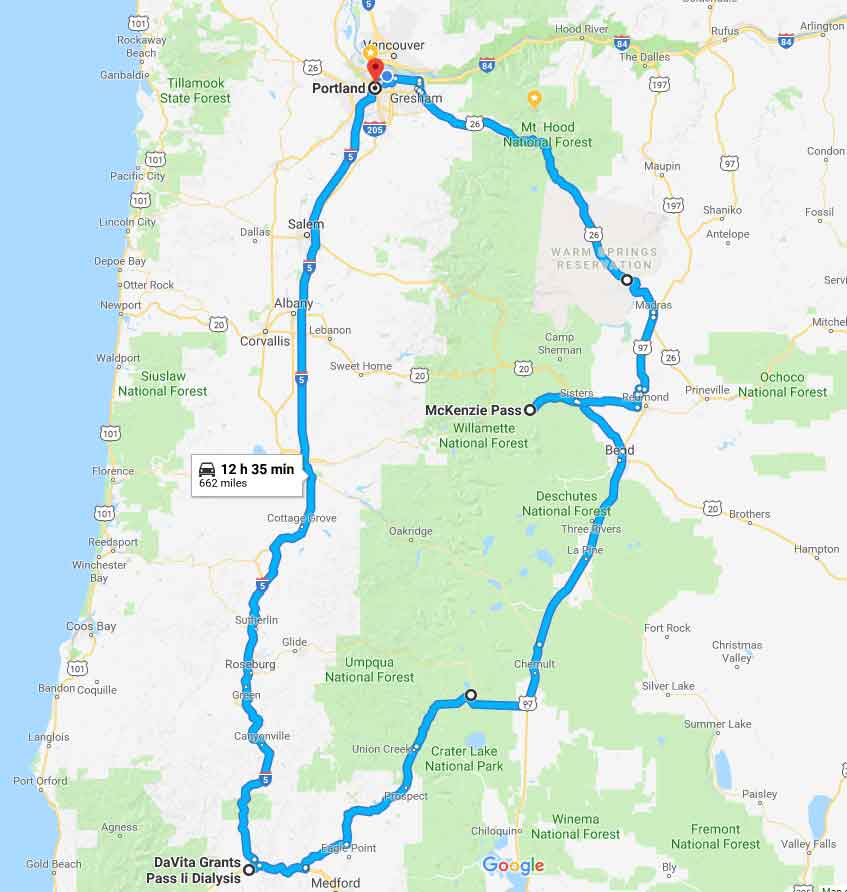
After spending the night in Grant’s Pass, I drove to Crater Lake, a sight I’ve always wanted to see ever since learning about it in first grade.
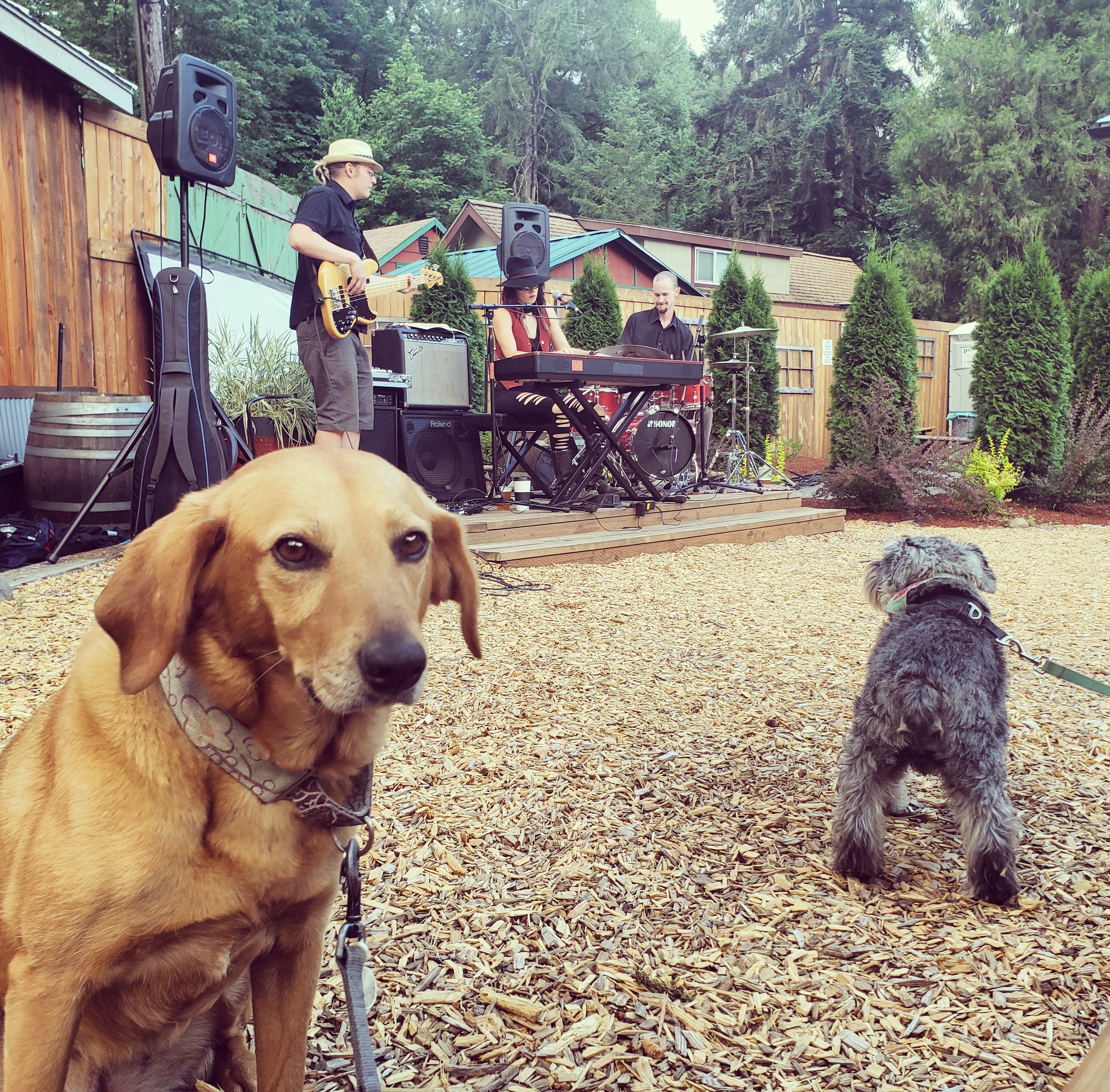
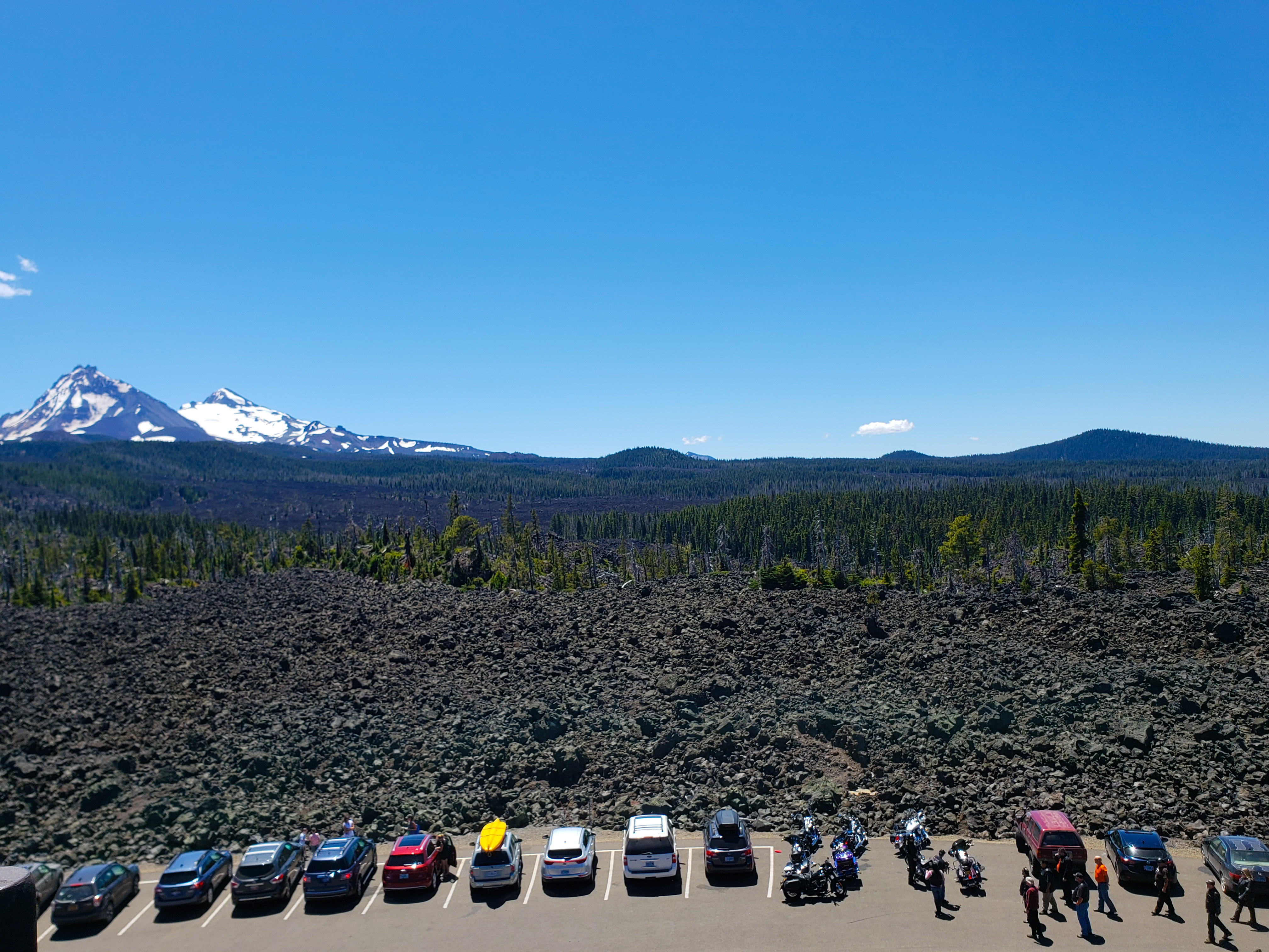
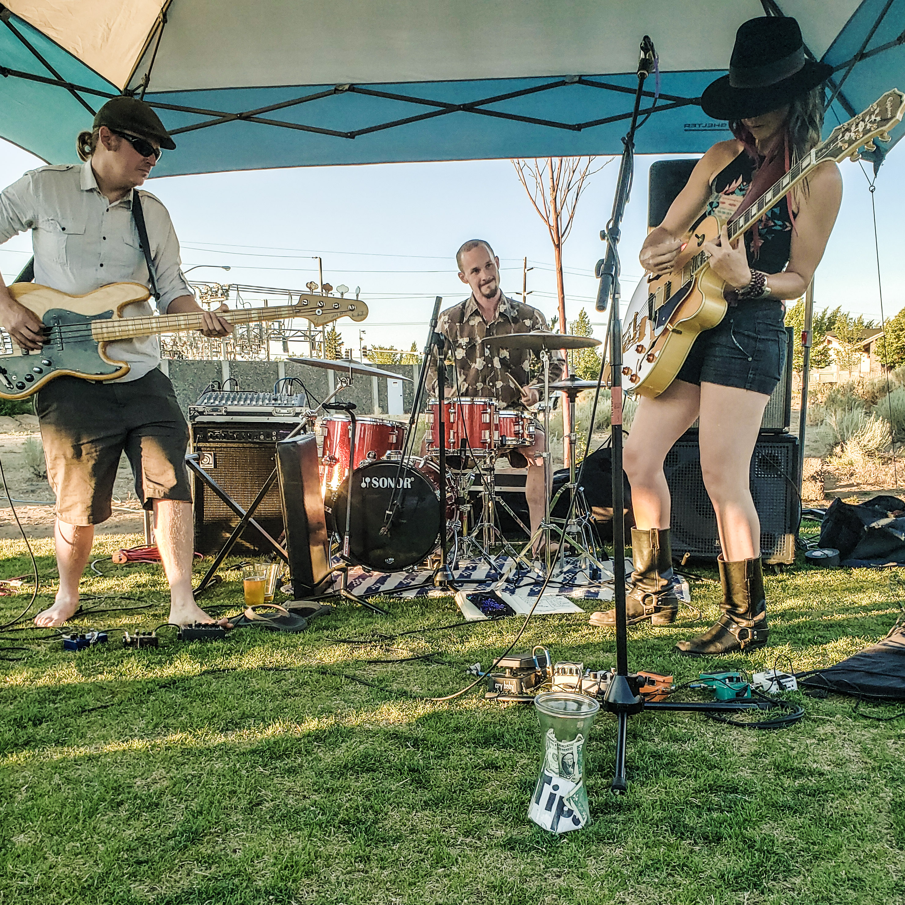
We camped outside in the Williamette National Forest after the Mckenzie Pass show. The next morning we left for Bend by way of the Mckenzie Highway, which is a pass between Mt. Jefferson and South Sister thats only open in the summer months. I witnessed miles and miles of lava fields, which I find absolutely fascinating!


This short but very sweet road trip was truly unique, and an experience I hope to remember for a long time.
]]>Therefore, I want to demonstrate how to leverage modern technologies like Gulp and Twig so that WordPress Theme development is cleaner and smoother.
Note that I am definitely not an expert here. I am only trying to explain my experiences in becoming a better WordPress developer. Reading documentation is crucial, but almost equally as important accounts from people who tried similar things as what I’m trying to do, even if the post is a few years outdated and/or not the best solution. For me, its all about perspective!
My Intent
Ultimately, I want to do less PHP and focus more on front end development, usability, and Even though WordPress is PHP based, I am going to use NodeJS and Gulp to compile and manage my CSS and JS assets. I will use Zurb’s Foundation for my front end framework to assist in my layout and presentation, and Timber, which will let me create Twig templates.
I am assuming anyone reading this post is familiar with SASS, Twig, and the importance of modular web design.
HTML
First, lets make HTML development easier with Timber and Twig. Twig is whats called a Template Engine, and its a way to marry the structure of a webpage to it’s data, or content. Timber is a plugin that allows Twig to be used with WordPress.
See WordPress Development with Twig and Timber
CSS
Then I’ll show how I organize and isolate my styles, and use Gulp and a CSS preprocessor (like SASS) to compile those styles into a single CSS file. Also, I’ll demonstrate how to use SASS to customize a CSS Framework like Bootstrap or Foundation.
See Leveraging SASS in WordPress Development and Customizing Foundation for a WordPress Theme
Javascript
Finally, I’ll use Gulp again to manage, compile, and minify my Javascrript assets. I like having separate Javascript files for each widget / component found on the site, then compiling those files into a single scripts file.
(Blog post coming soon)
My motivation here is to demonstrate how I use the work of others to improve my own WordPress development and create some sense of modularity. I haven’t discovered anything unique here, I am simply showing how to use existing tools like Gulp and Twig to improve my WordPress development.
]]>I have a love hate relationship with WordPress. I love that it is responsible for so much web content. I love how it has been a pioneer for content management systems, making it easier for your average human to publish content to the web. I love the fact that I’ve had many projects that leveraged WordPress, and that I played a small role in helping my clients do business.
But from a technical and professional perspective, WordPress is frustrating to work with. As a front end developer, who likes to have control over HTML and layout containers, I find it difficult to develop creative solutions to unique problems. Sure WordPress is very extensible – there are tons of free plugins and themes that can extend WordPress and ensure no two WordPress sites will be the same. But that also means that a WordPress site can easily become bloated with an entangled mess of codependent code, putting the site at risk of slow load times, data errors, and even hacks.

Let me explain….
In my WordPress development experiences, ambiguity is a recipe for disaster. Yes, ambiguity is a factor in any project, but it seems to be much less manageable on WordPress projects. Unless the design of a website has been fully flushed out – all the layouts, all the content containers, all the look and feel of buttons and form inputs – unless all of that has been flushed out and agreed upon by the client before any code is written, the project will face ambiguity. Sure, part of my job as a developer is to be able to handle that ambiguity gracefully. I have to be flexible, and build the project carefully, and anticipate changes that might come in the 11th hour of the project. However, I’ve always found it difficult to be flexible in WordPress projects.
I often wonder is it possible to build a WordPress site using a modular design approach?
Modular Programming
As a kid, I liked building with Lincoln Logs and Legos1. I like building one piece at a time, then merging the independent pieces at the end. I like to build websites in a similar way. By breaking a website project down to a group of independent modules (such as navigation, form elements, article layouts, etc.), I create the flexibility needed to anticipate changes in the design, or unforeseen UI/UX hiccups that no one considered when the project started.
I avoided WordPress for the longest time because it was just too time consuming to make a site flexible enough to evolve over time. Most of my WordPress development was fixing broken elements, cleaning up code bloat, or scrapping hours of work and starting from scratch after the client suddenly decided to do something different. Sometimes I would spend months developing a site only to have it break a few weeks after launching because of some automatic update, or the client tried to do something I didn’t anticipate. These are common obstacles when developing any website, but when dealing with WordPress, these obstacles were a nightmare. WordPress development did not feel like building with Legos, it felt like trying to stay afloat in a sinking ship.
My point is, WP is a great tool when working with small websites, but its difficult to do unique and creative work, which isn’t fun. I’d like to continue using WordPress, given its popularity, but I also want to enjoy performing the work I do, and thats difficult to do when using WordPress. Specifically, as a developer using WordPress, I find it difficult to:
– Manage CSS, both global styles and page/widget specific styles.
– Manage script and style includes. I mean, why should I have to load assets for Contact Form 7 on every page if theres only one page containing a form?
– Create and extend page templates. I’m an HTML enthusiast. I don’t want to drown in a bunch of PHP templates and functions and hooks just to get the HTML I want.
– And don’t get me started on custom fields and custom post types. I am so grateful for plugins like ACF and CPT because I still have nightmares about trying to create custom WP sites without those tools.
I could go on and on here. I don’t mean to complain, all content management systems are quirky and no CMS will please everyone.
WP is constantly improving, and most importantly, is free. For that I am thankful. However, given the popularity of WordPress, I cannnot avoid it, and that makes me frustrated. I am a Front End Developer. I want to write clean HTML, Javascript, and CSS, and build useful web interfaces that create value for my clients. I like PHP, but I don’t want to live in it. Can I do that using a CMS that is also easy to use for the end user? I am sure I am not the only front end developer who wonders about a better developer-friendly way of working with WordPress
Further Reading and References
About Using Modular Approach in Front End Development
- Learning from Lego: A Step Forward in Modular Web Design
- Modular Web Design: The Age Of “Templates” is Over
- Modular Web Design: Building a Website that Grows with Your Business
- Modular Web Design: Faster, Cheaper & Better Than Ever
Find a Better Way
I certainly don’t mean any disrespect to WordPress. In fact, I hear WordPress 5.0 is about to be a thing, so I look forward to learning a new generation of WordPress.
For now, I wish to present my current WordPress setup. I have learned how to leverage Gulp and Twig to aide in my WordPress development, and I wish to share that. Stay tune…
]]>Every time I’ve placed a Youtube video on a page, its never as easy as slapping an IFRAME on the page. Sometimes the video loads dynamically, like when opening a modal window. Sometimes there is more than one video on the page, and you need to control the videos via javascript so that only one video plays at a time. Sometimes the web page being loaded needs to be as quick as possible, and therefore need to initialize videos on demand. To say to least, I almost always make use of the Youtube API to display videos on web pages.
I’ve posted a helper module to my Github account that abstracts the details of loading the API. The module encapsulates the code needed to load the API library asynchronously and also defines the required `onYouTubeIframeAPIReady` function that is called once the API is loaded and ready. The function fires an event from the body to notify other modules that the API is ready. Once the API is ready, modules can initialize players.
Default Usage
     var ytHelper = new YoutubeHelper();
     ytHelper.init(function() {

     	// DO SOMETHING ONCE API IS READY

     });
]]>Original Problem
I wanted to display screenshots of recent website projects that the user could easily navigate. I figured a modal window would be the best tool to display these screenshots.
I really like the Magnify jQuery plugin because I can easly scroll through the images by clicking on the image itself, or easily dismiss the modal window by clicking anywhere outside the image. (As someone who has mobility challenges, large clickable areas that trigger my desired actions, rather than specific tiny icons, are very appealing.) But, in my case, I am trying to display long images ( > 2,000px high), and when displaying these images in the Magnigic popup, the image would be squished to the height of the window.
I wanted to find a way to vertically scroll these images from inside the Magnific Popup modal window.
Solution
I produced a modal window that maximizes the width of an image and allows vertical scrolling. Starting with Magnific Popup v1.1.0, I acheived my UI goals with a few extra styles and initializing the widget with a afew custom configuration options.
First, here is the Twig template used to trigger the modal window. This snippet represents one gallery of images, and here is an example data object which would be used by this template
{% for screenshot in page.screenshots %} {% set thumbnail = page.media[screenshot.thumbnail] %} {% set caption = screenshot.caption|markdown %} {% set full = page.media[screenshot.full] %}{% endfor %}.url }})
Next, here is how I am initializing the popup/modal. The type of the popup widget will be image, and I am customizing the HTML template by wrapping the image in a div.scrolling-viewport container.
$(function() {
console.log('go to bed');
$('.project-thumbnail').magnificPopup({
type: 'image',
mainClass: 'scrolling-image',
image: {
markup: ''+
''+
'' +
''+
'' +
''+
'', // Popup HTML markup. `.mfp-img` div will be replaced with img tag, `.mfp-close` by close button
verticalFit: false,
titleSrc: function(item) {
return item.el.attr('data-caption');
}
},
gallery: {
enabled: true
}
});
});
Finally, I throw on some custom styles (SASS). Most notably, I give a max-width to an outer content container (.mfp-conten`) and make the .mpf-figure container a flexbox column. The footer (.mfp-bottom-bar) is set to not flex (flex: 0). The last step is to put a max-height and an overflow-y: scroll style on our .scrolling-viewport container.
.mfp-bg {
	z-index: 5000;
}
.mfp-wrap.scrolling-image {
	z-index: 5001;
	.mfp-content {
		max-width: 90%;
		margin: 0 auto;

	}
	.mfp-close {
		position: relative;
		right: 0;
		height: auto;
		line-height: 1;
		font-size: 40px;
	}
	.mfp-figure {
		display: flex;
		flex-direction: column;
		&:after {
			background-color: transparent !important;
		}
	}
	.scrolling-viewport {
		max-height: 75vh;
		overflow-y: scroll;
		xmargin: 40px 0;
		img {
			padding: 0;
		}
	}
	.mfp-bottom-bar {
		position: relative;
		background: #FFF;
		padding: 15px;
		display: flex;
		margin-top: 0;
		.mfp-title, .mfp-counter {
			line-height: 1;
			color: $navy;
		}
		.mfp-title {
			padding-right: 15px;
			flex: 1;
		}
		.mfp-counter {
			font-size: 80%;
			position: relative;
			flex: 0;
		}
	}
}
Results
]]>Warning: Trying to access array offset on value of type null in /home/jwblogger/jwBlogger/wp-content/plugins/codepen-embedded-pen-shortcode/codepen.php on line 16
Warning: Trying to access array offset on value of type null in /home/jwblogger/jwBlogger/wp-content/plugins/codepen-embedded-pen-shortcode/codepen.php on line 17
Today I will show another component from that same project that will allow the administrator to assign items to a user using a dropdown.
Check out the Codepen
In this particular example, the items are baseball teams, and we are assigning “favorite teams” to the user. To assign a team to the user, the administrator selects the team from the dropdown list, then clicks a button to assign the team to the user. Once the administrator adds 5 teams, the dropdown is disabled, and a message is displayed to the user.
The list used to populate the dropdown is an array of objects. Each object presumably will have ID and Name attributes.
The View
Let’s first take a look at my view (my HTML) of this component:
<add-to-list params="list: $root.filteredItems(), optionsText: 'name', submit: addItem, disable: (selectedUser().List().length >= 5), limitMsg: 'Stop it! you have enough favorite teams.'">
</add-to-list>
The component is a custom html element called `add-to-list`. This element, like all KnockoutJS components, has a params attribute. I use this attribute to pass data from my ViewModel to my component. The data I’m passing is:
- list
- The list used to populate the dropdowns.
- optionsText
- This mimicks the optionsText binding of KnockoutJS, and tells the component which property of the object to display in the dropdown.*
- submit
- Function to add the item to the User’s list
- disable
- Boolean expression that tells component when to disable itself.
- limitMsg
- Text to display when component disables itself.
*Yes, I could implement a ‘optionsValue’ binding. However, for demonstration purposes, I’m going to assume the value of each item in the dropdown list will be the ID property of each item.
Filtering the Master List
In this example, I am giving the component a function that returns a list rather than the list itself. This is so I can take out any items that the user already selected. Here is the function for that.
/* function to filter the main data list depending on what the user has selected */
	self.filteredItems = function() {
		return ko.utils.arrayFilter(self.allDataList(), function(listItem) {
			var match = -1;
			ko.utils.arrayForEach(self.selectedUser().List(), function(item) {
				if(item.ID == listItem.ID)
					match = 1;

			});
			return match <= 0;
		});
	};
Below is the codepen that demonstrates the complete component. My next blog post will show the complete admin screen that will contain this component combined with the edit-inline component from a previous blog post.
See the Pen Add-to-list KnockoutJS component by Jeff Wilkerson (@stljeff1) on CodePen.0
]]>Warning: Trying to access array offset on value of type null in /home/jwblogger/jwBlogger/wp-content/plugins/codepen-embedded-pen-shortcode/codepen.php on line 16
Warning: Trying to access array offset on value of type null in /home/jwblogger/jwBlogger/wp-content/plugins/codepen-embedded-pen-shortcode/codepen.php on line 17
In a recent project, I was working with a listing of people, and clicking on one person displayed the details of that person to the right of the listing so that the user could edit the details of the selected person. Within the form, the client wanted to show thetext fields as clickable text – clicking the text would toggle the text into an input field. Blurring the input field would toggle the element back to text.
The page already had KnockoutJS and Bootstrap available, so I decided to leverage those tools. I ended up writing a custom component to solve the problem. Here is the codepen showing my solution.
See the Pen Edit-Inline with Knockout by Jeff Wilkerson (@stljeff1) on CodePen.0
Included in this example is a custom binding that saves the value ONLY IF the user hits the ‘Enter’ key. This binding is not mine; it was inspired by a StackOverflow post (maybe this one?) or maybe by Ryan Niemeyer .
]]>